
PowerBook 165 Computer
Date Introduced: 1993 Design: Robert Brunner & Apple Industrial Design Group Words and Pictures: Adam Richardson
Following the disappointing Apple “Portable” in 1989 that weighed in at a hefty 16lb (7.25kg), Apple finally launched a true laptop with the PowerBook series. This started with the Model 100, 140 and 170 in late 1991, and went on to have a dizzying array of variants over the next 7 years, after which Steve Jobs returned to the company and streamlined the product line-up. I think it’s safe to say that the PowerBooks landed like bombshells in the market, instantly creating a design template that everyone else would follow. According to the Computer history museum, it took the #1 sales spot in the laptop market, and made over $1 billion in sales in its first year.
I owned a slightly later PowerBook 180 and used it to write my Masters thesis in Claris Works, hooked up to a 13” CRT external monitor which provided a color display to supplement the grayscale of the 180 itself. But this 165 belongs to Dave Hoffer, who kindly lent it to be photographed.
(Click any image to enlarge.)
Evolution and revolution
“It is the most important thing I ever worked on there, and it’s a point of pride for me whenever I see that almost every laptop today is patterned off of it.”
The PowerBook line continued the Snow White design language that had been developed by frog design for Apple in the early 80’s, but rendered it in a new graphite gray that made the machines instantly recognizable. The color change away from the “Platinum” marked the first big change to the Snow White language. This shift was led by Robert Brunner after he was hired away from Lunar Design to became Director of Apple’s Industrial Design Group in 1989. The PowerBooks were one of the first products to be designed entirely under Brunner’s leadership.
In particular, the idea of moving the keyboard back and placing the trackball centrally in front of it with palm rests on either side immediately led to all PC manufacturers following the same pattern. Brunner credits the initial idea of this layout coming from an electrical engineer on the project, who had been experimenting with different arrangements of the internal components. Brunner immediately realized the ergonomic improvements of this layout.(1) It seems so obvious in retrospect, but somebody had to do it first.


Compaq LTE, 1989 (image: Wikipedia)
Even having an integrated way to control the cursor was unusual — PC laptops at the time barely had graphical interfaces, and so the pointing device was treated as an afterthought. For example, the Compaq LTE introduced in 1989 was a breakthrough for performance in a 7lb package (and which Brunner credits for pushing Apple to take risks to achieve a smaller size), but lacks any built-in pointer control. The Apple Portable had a trackball, but it was located to the right of the keyboard, and as Brunner joked, if he flew with the 18” wide Portable he had to get a first-class seat on the aisle on the left side of the plane, otherwise he’d be constantly elbowing the passenger to the right while moving the cursor around!
Combining the built-in trackball with the machine’s relatively (for the time) light weight of 6.8lbs (3kg) made the PowerBook one of the first true laptop computers you could actually use in your lap.
Aside from the color, the other design language departure was in the raised ribs that covered half the lid, where slots had been employed in desktop machines. Presumably this was done to provide more grip to the otherwise quite slippery body. The housing was made of polycarbonate, shiny and with a heavy texture - likely also to provide some grip in the hand, and perhaps also to help hide molding imperfections that can be a problem with polycarbonate, especially in darker colors.


Another clever feature was the feet on the back side corners: Discs with stumpy feet that could be rotated around to tilt the machine up slightly, or rotated back to fit flush within the overall form. Moving from one position to the other involved a very satisfying mechanical click action.
Like the desktop machines, the PowerBooks used zero-draft tooling, allowing all the sides to be perpendicular — something harder to accomplish in this smaller size. But it contributes to the clean, geometric look of the machine.
I recall at the same that lots of designers and design firms tried to take credit for some aspect of the Powerbooks (this was at a time when Apple’s Industrial Design Group was small and relied heavily on consultants). While Brunner had a strong hand in the design, he was not the only one involved. The best list I’ve seen of the designers also includes Apple designers Gavin Ivester and Suzanne Pierce, Apple engineers Jim Halicho and Eric Takahashi, Mike Antonczak of InDesign (a small design consultancy, before the Adobe software!), and Matt Barthelemy of Lunar Design.(2)
Technical Details
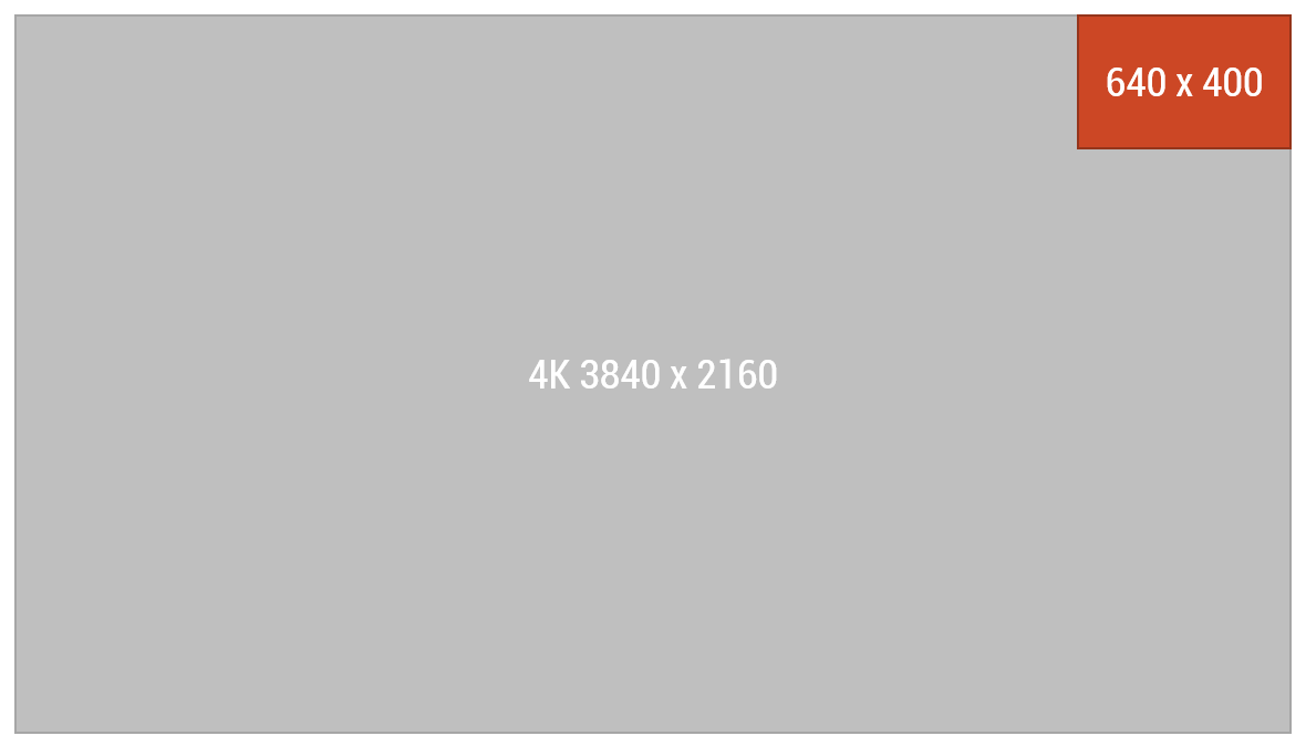
165’s screen resolution compared to modern 4K screen
The 160 featured a 33Mhz Motorola CPU, 4MB RAM expandable up to 14MB, and a 9.8” passive grayscale display at 640 x 400 pixels, resulting in a 77 ppi resolution. (Interestingly, this aspect ratio is identical to the 16:10 ratio screens found on modern Macs, rather than the 4:3 ratio of 640x480 VGA that was standard at the time, or that was used in later Powerbooks before the Titanium G4 appeared with a 16:9.)
The hard drive was either 80 or 160MB, and a 3.5” floppy drive slot was on the right hand side. The NiCad battery lasted only about 2-3 hours, and could be pulled out and replaced with a freshly charged one. The overall size at 2.25” (5.7cm) thick and 11.25 x 9.3” (28.5 x 23.6cm) footprint was considered quite svelte for the time. Prices started at $1,970 in 1993 dollars (about $3,500 today), certainly making it a high-end machine.


What Gives it Soul?
The PowerBooks did for laptops what the original Mac did for desktop computers: actually made them personal. They were the first to look like real consumer product in the way we think about them now - clean, elegant and stylish rather than beige and utilitarian with odd lines and cooling vents scattered around. Less obvious at this remove is how much it was clear at the time that the person using it was put at the center of the design. The obvious-in-hindsight idea of moving the keyboard back to create the palm rest and area for the trackball being the main example of this. The PowerBooks were an immediate breath of fresh air in the still-nascent laptop market, and basically established the direction for all that was to come.
What wouldn’t have been so obvious upon launch was that the PowerBooks also started the transition away from the initial Snow White language, to forms and colors that could span a wider - and more personal - range of devices. By counter-example, look at the Apple Portable which basically copy/pasted Snow White in a simplistic manner onto a much smaller form factor, and it just didn’t work.(4) The PowerBooks were the first step in a long journey toward creating the contemporary Apple look.
Related Materials
Robert Brunner discusses the PowerBook and other Apple design history
In this 2007 video from the Computer History Museum in Mountain View, California, Robert Brunner and Jerry Manock (Apple’s first industrial designer, responsible for the original Macintosh) give presentations about and discuss Apple’s history of industrial design. It’s moderated by famed designer (and co-founder of IDEO) Bill Moggridge, who designed what is commonly considered the world’s first laptop, the GRiD Compass, in 1982. (Moggridge sadly passed away in 2012.) Several early Apple designers and engineers are in the audience and get shout-outs.
Brunner talks about the Powerbook starting at 38:55.
Original Request for Proposal for Snow White Design Language, signed by Steve Jobs
These are several pages from the whimsical “Snow White” call for proposal that Apple put out to multiple design firms around the world in 1982, including Ital Design in Italy, BiB in the UK, and frog design in Germany (though it was called Esslinger Design at the time). While the products that frog ultimately designed after winning the contract were quite white in color, the Snow White name came from the format of the RFP: 7 sample products (the “seven dwarfs”) that were to be the showcases for each firm’s proposed approach. Steve Jobs’ and Jerry Manock’s signatures can both be seen.


Notes:
Brunner in a USA Today interview
Brunner cites the name in the video as “John Krakauer”, same pronunciation as the well-known author. However the spelling is unclear, and I haven’t found another source for this name, so I’m unclear if he got the name correct.
A personal side-note: My first job as an industrial designer was at Sun Microsystems, and Mike was my mentor there, though I only found out that he worked on the Powerbook while researching for this article! This speaks to Mike’s humble nature. Mike also brought in Gavin Ivester, who had his own firm, Tonic, after Apple, to help on a project that I was doing the design on. Gavin went on to do a lot of great work at Puma.
It’s worth noting that frog created numerous concepts for small personal devices using Snow White, but did so with much more nuanced forms and colors than the Portable’s.
From the collection: Dave Hoffer