
Apple IIc Computer

Date Introduced: 1984 Design: frog design, Rob Gemmell Words and Pictures: Adam Richardson
1984 is remembered for George Orwell’s novel and for the launch of the Apple Macintosh, accompanied by a famous TV ad promising “why 1984 won’t be like 1984”. Less famously, Apple also launched the IIc computer that April. While the Macintosh was a search for the next big hit after disappointments with the business-oriented Apple III and the short-lived Lisa, the IIc was a continuation of the cash-cow product line that had put Apple on the map.
While the Macintosh and the Lisa pioneered the brave new world of the graphical user interface, the IIc continued with the more traditional text-based interface, despite being developed in roughly parallel timeframe. But if the software trod familiar ground, it was the design of the hardware that made the IIc famous.
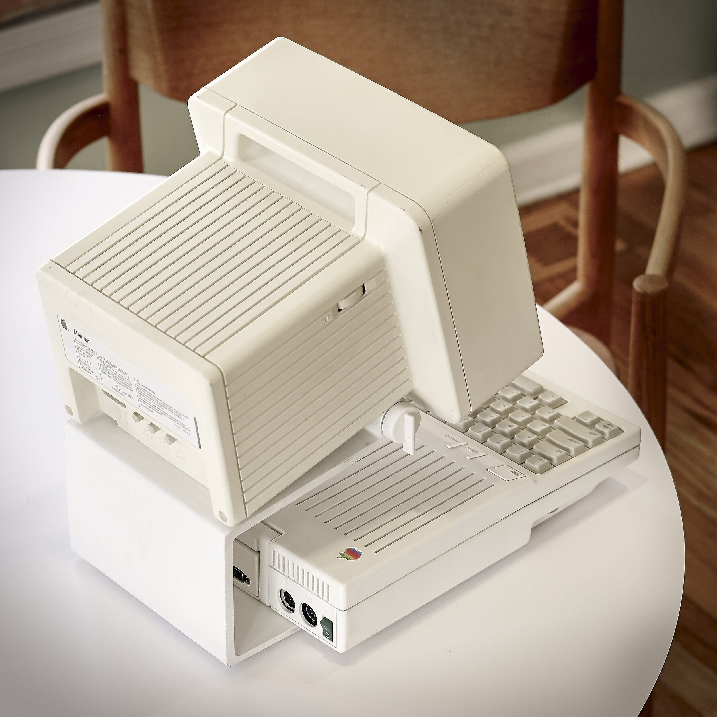
From a personal standpoint, the IIc has always been a favorite of mine. After a few years of learning programing on Sinclair computers while growing up in the UK, my first “real” computer experience was on early Macs, so I never actually used a IIc. However, I’ve always thought it was one of the most attractive, beautifully proportioned computers ever made. I was very excited to acquire the one you see photographed here, in almost perfect cosmetic condition, and then my friend Dave Hoffer (whose extensive products collection I’ve drawn from for features here on MMS) very kindly sent me the IIc monitor that he had so that the pair could be reunited as a complete set.
Click images to enlarge.
Initial Development
Work on the IIc began in late 1983, supposedly inspired by Steve Jobs seeing Toshiba first portable PC and wanting a similar portable in Apple’s line-up. Apple industrial designer Rob Gemmell began work on the overall form-factor and layout, leading to the slab shape with an emphasis on keeping it small and streamlined.
Like the Macintosh, the IIc has a handle to encourage portability and create a more intimate connection with the user. However, it’s not particularly easy to carry given that you must lug a monitor around as well. But even by today’s standards, the IIc is quite dainty in size for a desktop computer, with a footprint of 11.5 by 12 inches, and a height of 2.25 inches. The IIc was intended to be more appealing to home users, which lead to the emphasis on small size, and Apple put a lot of effort into miniaturization. Gemmell described it as “the cuddliest computer we have ever designed.”
The original price target was $995 but the actual price crept up to $1,295 by launch, equivalent to almost $4,000 in 2020. For this you got a processor running at a hair over 1Mhz (compared to 2Ghz+ today), with 128kB of RAM, and no internal hard drive storage. And the monitor was extra.


frog design and Snow White
The “Seven Dwarfs”
Doc, a next-generation Lisa
Sneezy, an Apple II-like home computer
Happy, a low-price Mac
Bashful, a book or tablet-style computer (see images here)
Sleepy, a mouse
Grumpy, a dot-matrix printer
Dopey, an external floppy drive
Additionally, there was a 5 1/4” hard drive nicknamed Flower.
The IIc was the first product to get the “Snow White” design language treatment. Snow White was the name of a design competition that Apple held in 1982 to find a design firm to make its industrial design truly world class. The Snow White term is sometimes stated to refer just to the color, in fact it was the code name for the whole initiative. (The off-white “Fog” color was developed as part of the design exploration.) The Snow White name was chosen because there were 7 devices (or “dwarfs”) that Apple wanted each of the firms to design in a way that created a unified look (see list at right).
The inspiration for creating a unifying design language across a diverse product line came from the unifying design work at Xerox undertaken by design firm Richardson-Smith (later Fitch-Richardson-Smith, then FRS, then just Fitch). Xerox of course was the company that made the Star personal computer and the original graphical user interface that were the inspiration for the Mac, so Apple would have been well familiar with Xerox products at the time.
The signature page from the Snow White competition RFP. Note Steve Jobs’ signature at top left.
Apple engaged several firms for the competition including BIB in the UK, Italdesign/Giorgetto Giugiaro in Italy, and Esslinger Design in Germany (which would become frog design after winning the contract and opening a Silicon Valley office). The firms had six months and $50,000 each to create their concept proposals. After exploring options that were more “Sony-like” and “Classic American”, Esslinger Design tried out a third direction that combined sleek and modern with upbeat and approachable. They rendered this aesthetic on the example products in very high quality models, and won the competition.
Snow White went on to become deployed across the growing product line through the remainder of the decade, and its influences continued into the 1990’s. The original PowerBooks represented the first major step away from it in 1993 though there are still many elements carried through in modified form.


The IIc and Snow White
Third slanted button from left labelled “Keyboard” toggles between QWERTY and Dvorak layouts (the latter apparently favored by Apple co-founder Steve Wozniak.
While the IIc was the first product to get the Snow White treatment, it didn’t quite get all the elements that would later appear. For example, because Rob Gemmell had already been working on the design and tooling for the plastics had already begun, the IIc didn’t get the zero-draft enclosure that characterized later products. (This means that all sides are exactly at right angles, and is most easily seen when looking at the parting line between the upper and lower halves: on most plastic products you’ll see that the surfaces come together in a “tent” but with zero-draft they are perfectly flat). The normal draft angle is to facilitate cheaper and easier injection molding. Snow White called for more complex and expensive tooling that would keep all surfaces planar and more pure - in fact the accompanying IIc monitor has zero draft surfaces as it was started later in the process.
And while the iconic grooves on the top of the case match most specs for Snow White (2mm wide and deep, on 10mm centers), they are not placed in relation to the case edges correctly. However, in just about all other respects, the IIc marked the beginning of the revolution in computer industrial design, brought about by highly-skilled designers combined with Apple’s engineering and marketing prowess and its sales success.
The IIc also debuted the new, brighter, whiter case color that marked a departure from the drab beige that Apple (like many computer manufacturers of the time) had been using right up to the original Macintosh. Other characteristics of the new treatment included:
Tight 2 and 3mm radii on edges and corners
Apple logo laser-cut and set into a matching recess
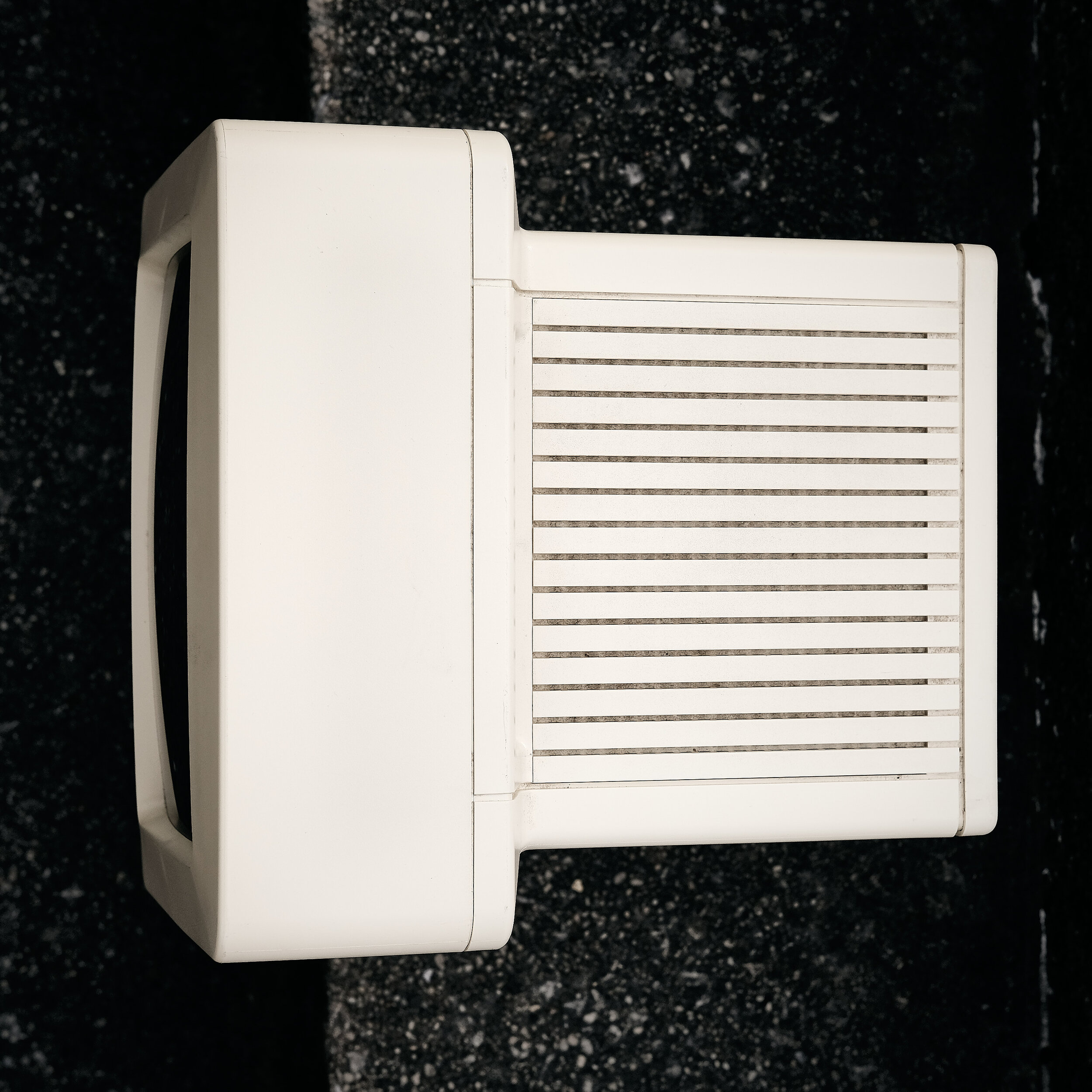
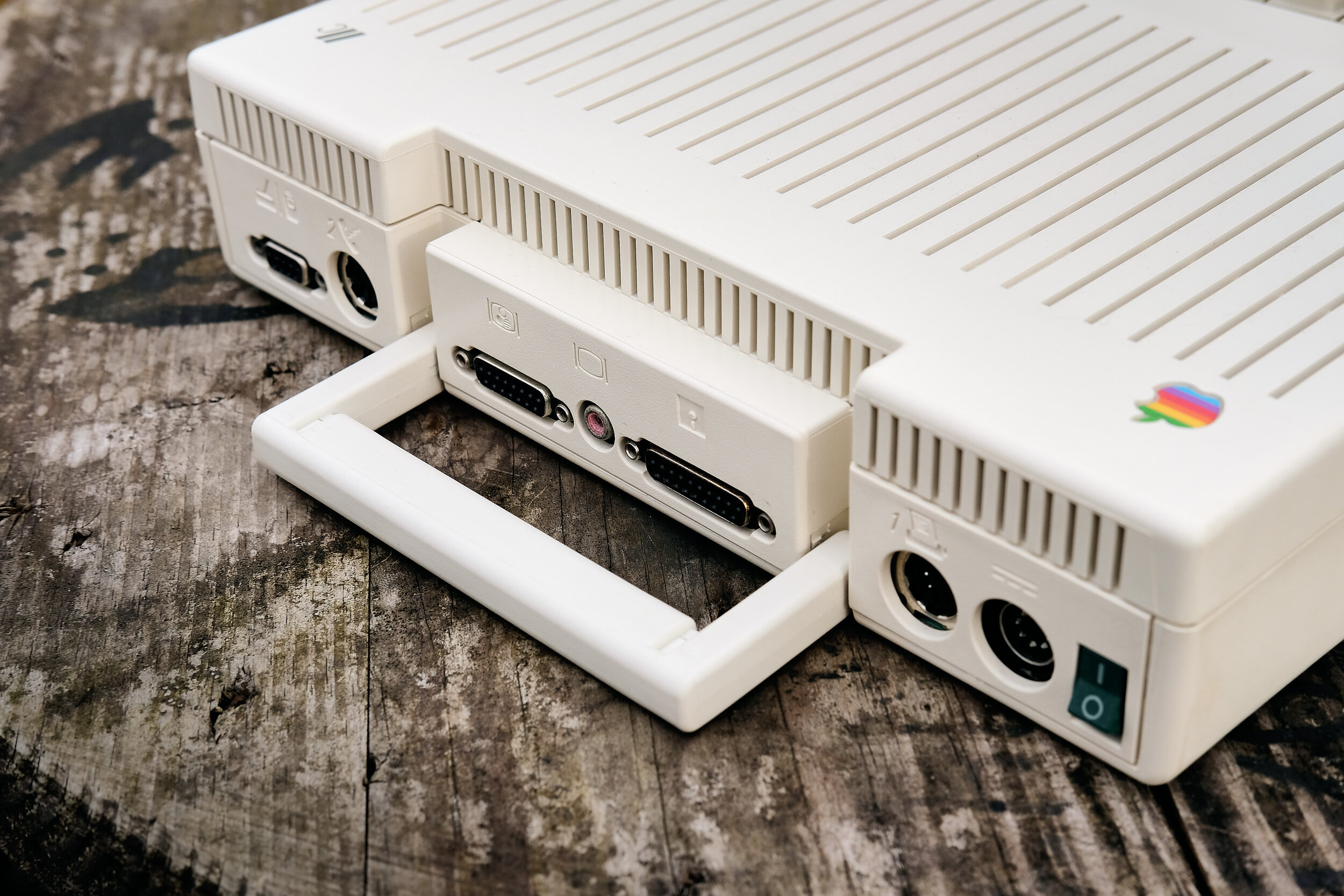
Molded-in iconography for the rear connectors (It appears that early versions of the IIc had screen printed icons over the ports as seen here)
Shaping the screen bezel so that it appears rectangular when seen straight on instead of bulging due to the spherical front surface of the CRT
An edge-to-edge keyboard.
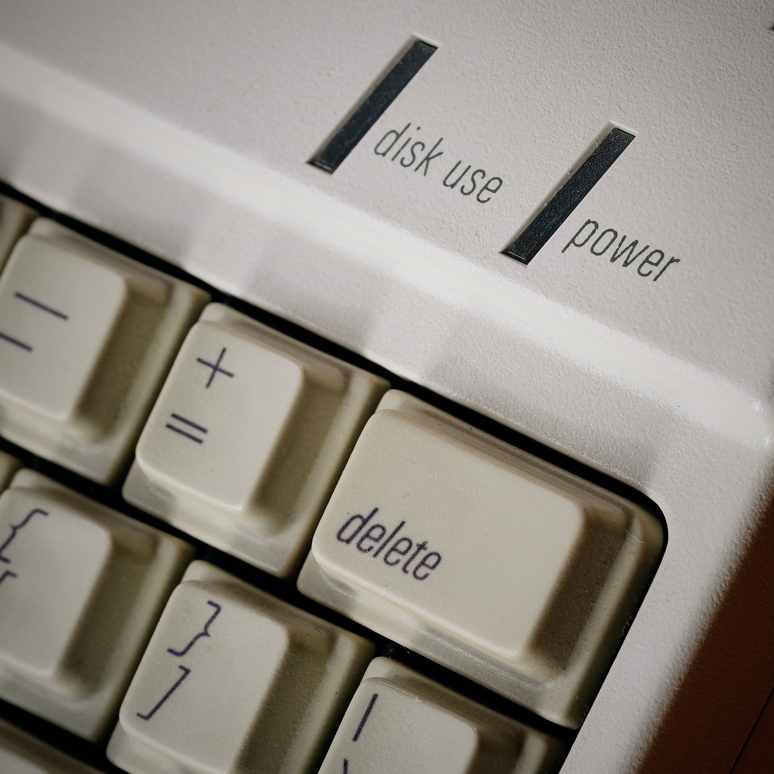
And has there ever been a better-looking font used on a modern keyboard? I don’t think so. The font is Univers Italic (as noted here), specifically Univers Condensed 48 Light Italic as recalled by Anthony Guido, who was a frog designer at the time, and also one of my first design teachers.* (Tony in turn was a student of Rob Gemmell at Ohio State’s Industrial Design program, and Gemmell had recommended him to Esslinger as they were looking to build their U.S. team.)


In addition to being uniquely edge-to-edge (a detail that would reappear on the Mac SE a couple of years later) the keyboard was unusually low-travel for the time. The keys were the same size as those on the larger IIe but employed a different mechanism which allowed the keys to be much more low profile. Apple claimed this “improved tactile and auditory response,” according to a review in Byte Magazine by John Markoff. A striking parallel to current design trends!
Marcin Wichary, who is writing an upcoming book about the history of keyboards, Shift Happens, observes:
The Apple IIc keyboard hinted at an exciting future that never came: Apple keyboards beautifully integrated with the rest of the machine, Apple keyboards making a design statement, Apple keyboards sporting typography you wanted to actually know more about.
The future instead ended up boring. Every time hence Apple could go with something exciting, it took a safe route instead: the original Macintosh, the iMac, even (yeah, I’ll say it) the iPhone with its traditional QWERTY layout. I understand why, but I miss Apple’s keyboards one could get excited about. We never again got a keyboard so fun and pure as that of the Apple IIc. Perhaps it was the hardware Dvorak toggle – possibly the last mainstream hurrah for the beleaguered layout, apparently Woz’s favourite – that doomed it to exist in an aborted timeline.


Reception
At the “Apple II Forever” launch event held in Moscone Center, took pre-orders for more than 52,000 machines at $1,295. However, that initial burst did not continue. Apple expected to sell 100,000 per month, yet only averaged that number per year over the course of its four years of production. Despite all of Apple’s efforts at miniaturization and simplification, it was the larger and more expandable IIe that won over far more customers.
Another knock against the IIc was that it was quite a closed system, with relatively little the user could do with the internals. John Markoff noted that “Portability and ease of use have clearly been gained at the expense of expandability.” Sound familiar? This and the Macintosh foreshadow Apple’s ongoing approach of locked down, non-user serviceable machines.
(Side note, I always get amused when looking at computer magazines like Byte from the 1980’s. This review appeared on page 276, not even half way through the magazine! Sure, 3/4 of the pages are ads, but still….)
The IIc was awarded “Design of the Year” by Time Magazine, and is in the collection of the Whitney Museum in New York.
What gives it soul?
There is always a risk with structured design languages that they can lack finesse when applied to a specific product, or that the implementation on the first product will be somehow clunky or overly-labored as the designers haven’t had time to settle in to using it yet. The IIc spectacularly avoids both these traps.
Compare it to the Tandy TRS-80 Model 100, for example, which came out the prior year in 1983, and has a similar slab layout. The Model 100 was its own kind of breakthrough, bringing computing power into a small package with an LCD display that pointed to a whole new category of portable devices. It’s a relatively clean and uncluttered design, but the IIc is miles ahead in terms of its refinement and overall formal approach. There is nothing unexpected on the Model 100, while you can tell that people sweated every detail on the IIc, that there were ideas driving the design, not just packing requirements.
Even if you knew nothing about its pivotal place in the design history of Apple - heck, even in design history of computers overall - I think you’ll be drawn to its combination of perfect proportions, rigorous yet jaunty detailing, and the monitor peering upward quizzically (with a shape not unlike the head of the alien in the contemporaneous movie E.T.).
Resources & Notes
Apple II History site - Comprehensive look at the history and development of the all the Apple II machines
Apple IIc review - Byte Magazine, by John Markoff, May 1984
Excerpts from Design Forward - by Hartmut Esslinger
* Barry Katz cites the font as being Garamond, however that is incorrect - Garamond was the font used in print advertising and packaging.